
Savour your fruits in liquid form
Tripple Z
Overview
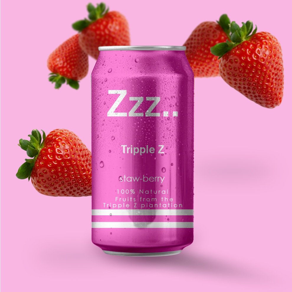
Tripple Z is fictional fruit beverage brand which focuses on making the can drink experience even more natural than ever. As a new brand coming into the can drink business, their main selling point is the fact that their drink are the most natural drink you will ever get.
My role
Sole UX/UI designer
Tools
Figma, Photoshop, Whiteboard and markers, Stickynotes.
DESIGN PROCESS

DEFINE
My first step was providing answers to the 5 W questions.
What?
A website for a beverage brand which also fulfils commercial goals, advert and gives information on the brand.
WHEN?
Users can access this website any time they feel like savouring the products of Tripple Z
WHO?
This drink is aimed at people who love fruits and natural fruit juices therefore the website has to relate to these same group.
WHERE?
This fictional brand ships to people with the UK and so the website is aimed for citizens of the UK.
WHY?
A website is a great tool you can for marketing of practically anything.
EMPATHIZE
This project was inspired by an existing brand in the UK (Syps). This brand is not a fruit drink though. It is a beverage that is supposed to hydrate you the same way water does. After looking at their website, I decided to come up with what I would have designed for them if I was given the chance.
Calling this project a redesign would not be hundred percent accurate but it is undeniable that I was trying to do a better job both UI wise and UX wise.
IDEATE
The ideation process here was a straight forward one given I had a reference I was following. I had to make sure I was using captivating images that make the brand pop and show quality.
Essential features
Add to cart
Easy check out
Be able to give feedback on each flavour
Showcase all available flavours
Subscribe to newsletter
Contact us function
Userflow

DESIGN
All my designs were done within Figma and on my whiteboard. I came up with low-fidelity wireframes on my white board to have an idea of how I wanted my different pages to look like. From there I proceeded to designing high-fidelity wireframes which I later on converted to a fully functional prototype.
The challenges I faced were at the level of making the pages interactive given that I equally animated some sections. This challenges only helped me grow.
Wireframes
Bellow are the low-fidelity wireframes I drew on my white board. With a project this simple and straight to point, I did almost no iterations while designing after drawing the low-fidelity wireframes.

Low-Fidelity
Design Styles
Color palette

Prototype

I proudly present a design crafted with meticulous attention to detail, utilizing Figma as my primary tool.
To enhance the user experience in this prototype, I integrated AI-generated anime images.
I dedicated myself to creating an intuitive and user-friendly design, ensuring a seamless and enjoyable interaction for all users.

Mock-Ups
HOME

LIBRARY

MY SHELF

MESSAGING

PROFILE

Get in touch with me.
if you enjoyed this project and want to drop your insights or want us to work together on something. Feel free to contact me.